So a few days ago I talked about how the use of color can affect the impact generated by your ad. In that post, I teased the fact that I would be writing a post about what different colors mean to consumers. This is that post.
First up, we have the color purple.

 Purple symbolizes things such as wealth, royalty, wisdom, power and magic.
Take a look at these two pictures. The top image shows Asprey, a brand which sells, among other things, a citrus fragrance called Purple Water. This use of color, both in the graphic and in the name, denotes a sense of luxury and prestige to the brand.
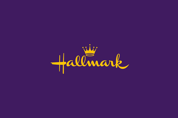
The second example here is Hallmark, a brand primarily known for cards, religious themed gifts and heartwarming films that my wife loves to binge-watch. Hallmark doubles down on the royalty imagery with the combination of its purple color-scheme with its distinctive crown logo. This also supports the embracing of the magic of the holiday seasons which Hallmark definitely capitalizes on.
What these two brands have in common is a feeling of richness and a quite sort of power behind there brands and logos.
Purple fosters feelings of calmness and strength.
Next, we have blue.
 The color blue symbolizes depth, stability, trust, wisdom and confidence.
Take a look at our examples this time.
We have Twitter, a social media platform in which people are allowed to express their feelings in 140 or fewer characters. While this imposes a sense of brevity, think of how many people go to Twitter for their news. The entire color scheme, even down to the blue verified check mark, bestows a sense of authority to the platform.

Facebook is quite similar, using the blue theme to foster a feeling of trust and community.
Both of these platforms can also be said to take advantage of the confidence building tone of the color blue, allowing people the freedom (confidence) to state their opinions to the world.
Let's look at the color green.
 Green brings with it images of growth, nature, harmony and health.
As such, companies with green logos often try to foster a natural, health conscious attitude in their public personas.
Starbucks obviously tries to cultivate this look, advertising that their coffee is "ethically sourced. Recently they announced that they would be eliminating plastic straws in all their locations by 2020. Despite being a large, corporate company, Starbucks has managed to more or less convey a public image of environmentalism.

Whole Foods is another company with a green logo, and bills itself as "America’s Healthiest Grocery Store™". Whole Foods specializes in natural, organic foods, and claims to focus on sustainability.
Both of these companies use the color green to show their values.
The next color we will look at is red.


Red, often associated with aggression, also conveys passion, energy, excitement, strength, love and power. I would argue that few colors evoke as many emotions as the color red.
Hype-brand Supreme uses the color red to invoke excitement and energy, as well as passion, which is something that the brand's fans certainly have a lot of.
McDonald's also uses the color. Research has shown that the color red actually makes people hungry. This may surprise you, until you take a moment to think of all the fast food brands that use the color red in their logos. Burger King, Wendy's, Arby's, Hardee's/Carl Jr's, and even the Taco Bell bell all use the color red.

CNN, of course, is not trying to sell you food. As a major news source, CNN's use of the color red conveys power and authority. There is even an element of excitement in play in the form of news alerts that pop up, be it on the television during regular programming or on the screen of your mobile device.
Red is a strong color that demands attention. It is best used for brands that need to make a strong impact on their market.
This has been a fairly simple look at four colors often used in advertising, as well as the reasons that they are used. Color is undoubtedly one of the most important elements of any visual media and it is important to know how to use it. Hopefully this post has given you some insight, and has inspired you to look further into the psychology behind these and other colors.
Here at The Catholic Globe we are fully capable of printing your ads in color and I personally would love to talk with you about how color can affect your ads with us.
Talk soon,
-Jacob
First up, we have the color purple.

 Purple symbolizes things such as wealth, royalty, wisdom, power and magic.
Take a look at these two pictures. The top image shows Asprey, a brand which sells, among other things, a citrus fragrance called Purple Water. This use of color, both in the graphic and in the name, denotes a sense of luxury and prestige to the brand.
The second example here is Hallmark, a brand primarily known for cards, religious themed gifts and heartwarming films that my wife loves to binge-watch. Hallmark doubles down on the royalty imagery with the combination of its purple color-scheme with its distinctive crown logo. This also supports the embracing of the magic of the holiday seasons which Hallmark definitely capitalizes on.
What these two brands have in common is a feeling of richness and a quite sort of power behind there brands and logos.
Purple fosters feelings of calmness and strength.
Next, we have blue.

Take a look at our examples this time.
We have Twitter, a social media platform in which people are allowed to express their feelings in 140 or fewer characters. While this imposes a sense of brevity, think of how many people go to Twitter for their news. The entire color scheme, even down to the blue verified check mark, bestows a sense of authority to the platform.

Facebook is quite similar, using the blue theme to foster a feeling of trust and community.
Both of these platforms can also be said to take advantage of the confidence building tone of the color blue, allowing people the freedom (confidence) to state their opinions to the world.
Let's look at the color green.
As such, companies with green logos often try to foster a natural, health conscious attitude in their public personas.
Starbucks obviously tries to cultivate this look, advertising that their coffee is "ethically sourced. Recently they announced that they would be eliminating plastic straws in all their locations by 2020. Despite being a large, corporate company, Starbucks has managed to more or less convey a public image of environmentalism.
Whole Foods is another company with a green logo, and bills itself as "America’s Healthiest Grocery Store™". Whole Foods specializes in natural, organic foods, and claims to focus on sustainability.
Both of these companies use the color green to show their values.
The next color we will look at is red.


Red, often associated with aggression, also conveys passion, energy, excitement, strength, love and power. I would argue that few colors evoke as many emotions as the color red.
Hype-brand Supreme uses the color red to invoke excitement and energy, as well as passion, which is something that the brand's fans certainly have a lot of.
McDonald's also uses the color. Research has shown that the color red actually makes people hungry. This may surprise you, until you take a moment to think of all the fast food brands that use the color red in their logos. Burger King, Wendy's, Arby's, Hardee's/Carl Jr's, and even the Taco Bell bell all use the color red.

CNN, of course, is not trying to sell you food. As a major news source, CNN's use of the color red conveys power and authority. There is even an element of excitement in play in the form of news alerts that pop up, be it on the television during regular programming or on the screen of your mobile device.
Red is a strong color that demands attention. It is best used for brands that need to make a strong impact on their market.
This has been a fairly simple look at four colors often used in advertising, as well as the reasons that they are used. Color is undoubtedly one of the most important elements of any visual media and it is important to know how to use it. Hopefully this post has given you some insight, and has inspired you to look further into the psychology behind these and other colors.
Here at The Catholic Globe we are fully capable of printing your ads in color and I personally would love to talk with you about how color can affect your ads with us.
Talk soon,
-Jacob
Comments
Post a Comment